“A picture is worth a thousand words”
A complex idea can be understood effectively with the help of visual representations. Exploratory Data Analysis (EDA) helps us to understand the nature of the data with the help of summary statistics and visualizations capturing the details which numbers can’t.
In this post, let us explore
- Visualizing the data
- Summarizing the data
- Correlation matrix
Visualization
Depending upon the type of data, we can choose different types of graphs for visualization. I have listed some of the possible graphing options under different combinations of types of data:
- When both variables are continuous
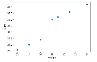
- Example: Weight, Height. We can use scatter plots
# Scatter plot

import matplotlib.pyplot as plt
%matplotlib inline

#Provide x and y variables
plt.scatter(data1['Weight'], data1['Height'])
plt.xlabel('Weight') #X axis
plt.ylabel('Height') #Y axis

plt.grid(False) #removes gridlines
- Distribution plots
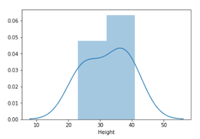
#Distribution

import seaborn as sns
sns.distplot(data1['Height'])
- Kernel Density Estimation plots
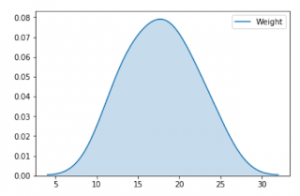
#KDE plot
sns.kdeplot(data1['Weight'], shade=True);
- Joint plots
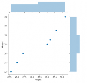
#Joint scatter and distribution plot
sns.jointplot(x="Height", y="Weight", data=data1);
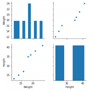
- Pair plots
# Seaborn visualization library
import seaborn as sns
# Create the default pairplot
sns.pairplot(data1)
- When one variable is categorical and the other is continuous
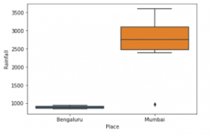
- Example: Place, Rainfall
- We can go for box plots
# Box plot
sns.boxplot(x='Place', y='Rainfall', data=data2)
- Bar plots
#Bar plot
sns.barplot(x='Place', y='Rainfall', data=data2);
- When both variables are categorical
- Cross-tabulation
- Correspondence analysis
- Heatmap
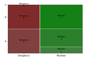
- Mosaic plots
# Mosaic plot
from statsmodels.graphics.mosaicplot import mosaic
mosaic(data3, ['Major network', 'Place'])
Summarizing the data
- Use describe() option in pandas to summarize the data
- If the data set is only numerical, describe() will display summary statistics for all columns
- Even if all columns are categorical, describe() will display summary statistics for all columns
- But if both categorical and numerical columns are present, by default describe() will display summary statistics of only numerical columns. In that case, we can use describe(include=’all’)
Correlation Matrix
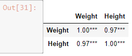
Correlation matrix provides the correlation coefficients among the variables. I prefer to have p-values along with correlation coefficients in the correlation matrix.
Following is the code from tozCSS answer on stackoverflow. This gives a correlation matrix along with correlation coefficients and p-value. I added only one more line of code to format correlation coefficient even it is not significant.
from scipy.stats import pearsonr
import pandas as pd

def calculate_pvalues(df):
    df = df.dropna()._get_numeric_data()
    dfcols = pd.DataFrame(columns=df.columns)
    pvalues = dfcols.transpose().join(dfcols, how='outer')
    for r in df.columns:
        for c in df.columns:
            pvalues[r][c] = round(pearsonr(df[r], df[c])[1], 4)
    return pvalues
rho = data1.corr() #change data source
pval = calculate_pvalues(data1) #change data source
# create three masks
# create three masks
r1 = rho.applymap(lambda x: '{:.2f}*'.format(x))
r2 = rho.applymap(lambda x: '{:.2f}**'.format(x))
r3 = rho.applymap(lambda x: '{:.2f}***'.format(x))
r4 = rho.applymap(lambda x: '{:.2f}'.format(x))
# apply them where appropriate --this could be a single liner
rho = rho.mask(pval>0.1,r4)
rho = rho.mask(pval<=0.1,r1)
rho = rho.mask(pval<=0.05,r2)
rho = rho.mask(pval<=0.01,r3)
rho
Summary
In this post, we have explored various visualization techniques, when to use which graph, how to get the summary statistics and correlation matrix.
If you have questions or suggestion, do share. I will be happy to respond.

