

Some years ago I got tired of people telling me they didn’t like the way my Web sites looked. “Old school” can be a compliment, but I think more importantly, things like “doesn’t look legitimate” brought me to the “don’t judge a book by its cover” response approach.
But let’s get serious here – what good is a beautiful design if the user can’t use it effectively and efficiently? To me the value has to do with what the goal is. If you want something beautiful to look at and useless, go ahead, but I decided to let the user control their look and feel (L&F). So I set up my menu system to support essentially unlimited capacity of the user to change things to the limits of Web technology. And it worked, for a while, in that I would start users out by setting up their look and feel and the net effect was that they spent more time on L&F than getting anything actually done.
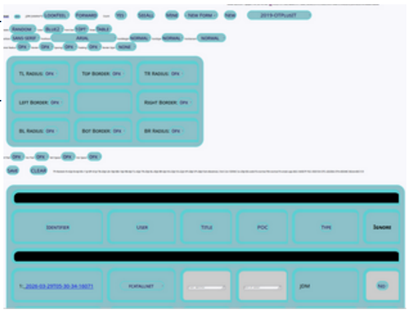
At right is an example of a random selection for L&F – the most popular thing for folks to do repeatedly till they find something they like and then make a few changes.
Below is a default with slightly larger font size that I commonly use showing the same information.
Over time I have adapted my approach, and recently, I have started to think and implement in terms of adapting systems to users based on the users’ cognitive capabilities in addition to than their preferences. Hence the use of cognitive games for constraining user interface behaviors. |
 |

Using user-defined L&F make a lot of sense and the “have it your way” approach is one that I like. With a not too bad default and the ability to control a relatively small number of things, users get something they can see clearly and use reliably without surprises. This led me to my current version of the L&F interface used in many of my AI-developed applications:
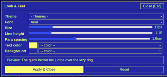
This (above) version allows setting themes from a fixed set, setting font type and size, line height, paragraph spacing, and text and background colors. It works well and comes with a set of rules I try to enforce. Unfortunately the AI vibe coding environment does a poor job of enforcement and comes up with all sorts of crazy things that do not follow the standard(s) identified. These standards include things like no dimmed text, no smaller fonts (than the defined size), and for emphasis things like underlines, boldface, and italics are allowed. The purpose is that the user sets what they want and the browser remembers it, so they can always see what they are looking at. There are always exceptions for specific sorts of color applications, complex diagrams or network graphs, etc. but the idea remains the same. I should be able to see what I am looking at, and if I like gray on black in 8pt Clown font, I should be able to get it.
Corporate L&F
One of the problems with this approach is that it doesn’t follow the corporate themes and colors of companies that a part of their brand. Of course if you want to use these color and other restrictions that’s fine, just don’t let the user control them and let then control the rest. But I strongly advice high contrast for non-adaptive font and L&F approaches because when we cannot see what you are trying to show us, you probably won’t convey the message your site is intended to convey.
The cognitive approach
The idea behind the cognitive approach is that the interface should identify and address the cognitive limitations and needs of the user. There are plenty of requirements for handling special needs, for example, in education and many government sponsored systems. This includes audio for folks with some sight limitations, visual for some with hearing impairments, and so forth. All good things for meeting needs, but in my view, lacking in the subtleties of improved human interaction. In the cognitive approach, the idea is to adapt to the user, not just make a few special cases work, but rather abandon the i=notion that you can design for my abilities and have the system adapt to me.
How do we measure and adapt?
Part of the problem we face in this approach is that we need to measure your cognitive mechanisms and use those measurements to adapt the system, both initially and over various time frames. As I write this, it is 0242 and my screen is running at 70% brightness with one light on in the room. Later in the day the screen will likely be at 90% brightness, the sun will be too bright in the room and I will need to have shades set up to block it from making me screen blind if I keep using the computer. So that kind of adaptation is closet to real-time than some longer-term issues, like font size in real world terms associated with my ability to see at the distance from screen to eye. So we have inherent properties and limitations of sensors (human in this case) and cognitive processes, the environmental conditions, and the temporal aspects of how these change in context to consider in measuring and adapting.
I am still working at a gross level of adaptation, but the path to fully automated near-real-time adaptation seems clear once you start to see how to do this, if you hear what I am trying to tell you.
Quickly now...
Speed is an important aspect of interaction. How fast you are thinking dictates the rate of information you can receive and your ability to operate your actuators limits the ability to react to what you process. Those of you reading the book I am writing on how to survive the cyber age will recognize the control system viewpoint. Sensors, actuators, communications and control – the cybernetic system. Measuring brain speed and hand-eye coordination, response times to stimuli of different sorts, is at the heart of the matter. And while you do that you can also measure other things. This was implemented as a sort of game as part of working with a brain specialist to help improve cognitive speed and certain specific conditions. In essence you play the game and it measures a few things and pushes you to improve them.
ThinkFast is the current name of the software and you can run it from Games at all.net at any time. We don’t collect or see your measurements, and this like the other ones you see here are designed for you the user to gain information and seek improvement on your own. They are implemented in javascript for ready browser access and use localStorage on your browser to keep your data. Without going into details (part of the value is that you learn how it works by playing 9it and there are no real instructions as people can figure it out as part of the goal of having you find and improve your own performance in cognitive tasks).
Look here!
ThinkFast has been operating for several years now, and I recently started to adapt the basic concept for other utility. One of the important ones for user interfaces is the application to detect and differentiate different sorts of color and contrast sensitivity. It starts with a chart (optionally) so you can set your sensitivities yourself. Different people will make different selections on the left and right sides of the middle of each row. The idea is to select the nearest ones to the center you can see well enough to detect the X. Each row represents different sort of known color or contrast sensitivity and the contrast between the two colors (or gray shades) varies from none in the middle to maximum at left and right for background vs foreground. By selecting your values, you tell the system your current perceived limits of differentiation. These mechanisms are based on the Ishihara test used for people to find hidden numbers, but in the case of this system, used to differentiate shapes with timing.
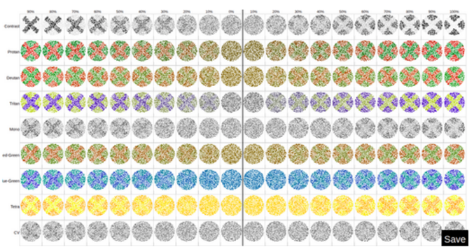
You will likely notice that your ability to clearly differentiate the X differs row by row, and that it is based on your specific color or contrast sensitivity and your lighting and other conditions. Regardless of the specific conditions and your sight limitations, you can select the left and right item in each row closest to center where you can differentiate well and that tells the system what to show you to make it easy (or hard) to show/hide things from you. One of the rows is used to differentiate computer vision from human vision and might be useful for detecting humans vs. computers for things like human presence detection, until the computers are programmed to act like people with various conditions. And of course it can be used as a sort of authentication to detect a user with different color and contrast sensitivity than their profile indicates.
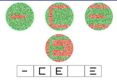 |
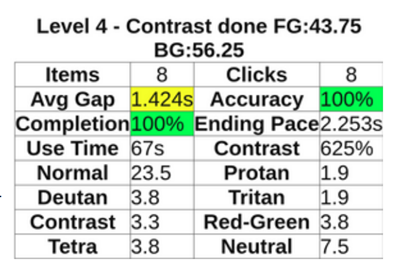
In the game, the system intentionally plays around the specified boundaries to try to get to an 80% correct selection rate, which both calibrates your sensitivities for actual vision and seeks to increase your speed and ability by making it more fun (or successful) to be able to see more things more quickly. At left you can (maybe) see different shapes to be differentiated and selected from the menu at bottom. The circles appear at higher rates and in smaller sizes as you progress always seeking to get you to 80% right answers over time. |
The better you do the faster and closer to visibility limits for you it gets, and along the way it measures conditions and performance characteristic in those conditions providing statistics on different visual sensitivities as well as time for detection. Again, it has the objective of finding and improving your ability to do the things you can do. That is not to say it provides some sort of cure for color or contrast sensitivity. It just helps you perform. |
 |
Hear what I am saying?
I won’t be able to show you the hearing measurement and adaptation game because it involves sounds and this media is not very good at getting at those issues. But the linkage between sound and visual understanding is available to give you an idea of these measurements.
In this case, the game is focused on identifying both the edges of your hearing in terms of frequencies and volumes and your sensitivity and pitch sense across the range while trying to make a musical game. This one is still in development, but to get a sense of it, this game plays single notes at different volumes and frequencies and the user responds by selecting what was heard. There is visual output that may or may not correspond to the note playing so that the ability to identify sounds is detected. As it progresses it moves toward more complex things like tunes, chords, and so forth.
Hearing changes with time for most people, computers can typically perceive sounds that humans cannot, and again, for an interface to be meaningful in the sonic arena, sounds have to be heard by the listener.
Don’t play around with me
There is a question of how you get the data and what you do with it. Doing medical tests and using the results for interface customization seems a bit over the top for each Web site and because of privacy issues, obtaining, storing, sharing, and otherwise using such information, for example to sell me things, has legal, regulatory, and reputation problems.
- The path I chose so far is to make these mechanisms available as games the user plays or settings they set. It’s under user control, so they can decide on what they want.
- The automated mechanism version of this would measure the individuals and use the measurements for adaptation.
- An alternative I also like is high contrast clear separation both of sound and sight and using but not depending on colors or similar mechanisms as the sole means of access.
- Another approach would be to adjust the interface over time starting with high contrast and moving toward more of the artistic design, or alternatively using the artistic design ignoring user preferences and move toward user preferences over time or as they get deeper into the site.
- Perhaps an even better approach would be to take these factors into account in your user interface design and make the art serve the full function of beauty, brand, and user friendliness.
Privacy and preferences
I like to view the issues of privacy and preference as the same thing and as owned by the user. I think a good way to go about addressing these issues is to have user preferences enveloped by cognitive measurement and customized form there by user preference. And I prefer the approach where the user owns their own underlying data, revealing only the preference results to the systems they use.
With the games discussed above, the adaptation happens locally and is stored locally in the user’s browser. While current browser mechanisms are poorly implemented for this purpose, a formulation with user controlled cookies or stored files on their system, or perhaps a mechanism tied into the authorization processes through directory services or identity management, could reasonably be used to store the results of detection augmented by individual selection, applied across all sites and applications, and with a common or standard interface specification to limit variability by service providers and engender adoption.
As a basic concept, if only preferences in terms of ranges of allowable values were shown, they could not be differentiated from any underlying limitations associated with medical or other limitations of the individual.
Another approach I have explored is the use of a more intelligence “browser” (user) side of the relationship between service and content provider and consumer. The basic idea is for the consumer to receive the content in whatever form it arrives and produce user interface locally by rewriting for presentation in the style of the user. To some extent this is already done at a gross level today in two forms:
- Automated translation for Web sites by browsers is an example of translating content in near-real-time for users that works reasonably well today.
- Inverted (dark or light) “themes” for interfaces provide a user-configured overall interface specification that could be integrated into automated or game-based detection for user preference setting.
Conclusions
It seems to me that the ability to detect and differentiate cybernetic (including human) systems (or people) based on their cognitive limitations, including their ability to sense, act, and make decisions in time frames should be a core element in any system design intended to interact or escape interaction with those systems or people. And the design of such systems should be such that the design goals are achieved through the interfaces responsible for those interactions. I prefer the approach of measurement augmented by preferences owned by the user and not revealing the basis but only the decisions. Maybe I just like black on white, and you like beige on brown. Have it your way and let me have it mine.
Click Here to Enroll for an Online Certification Course in Artificial Intelligence.